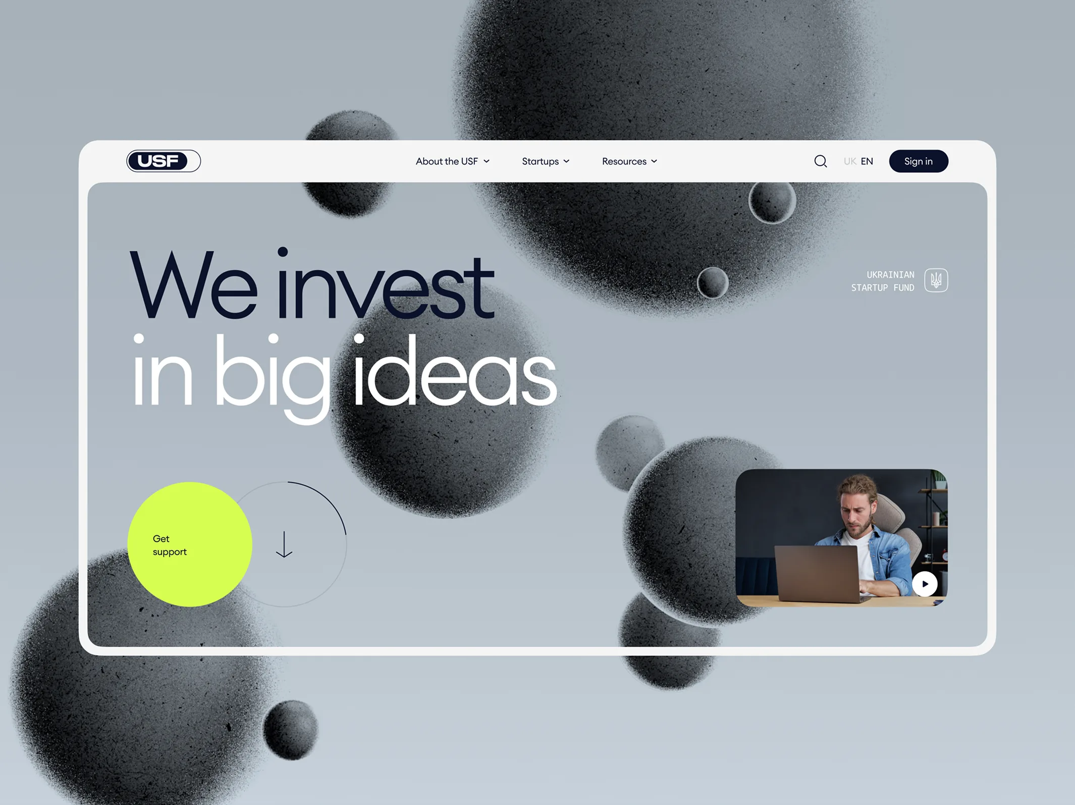
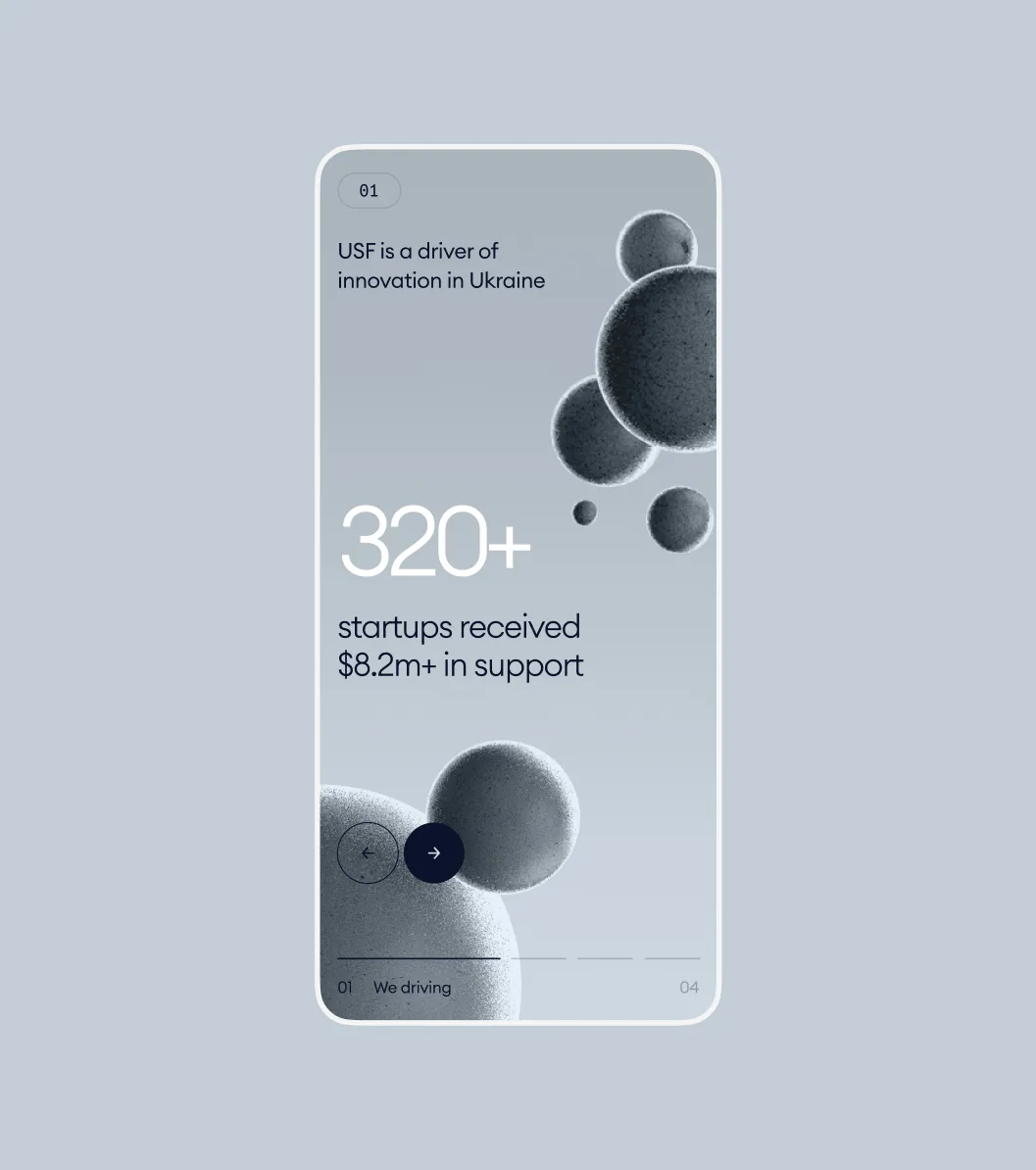
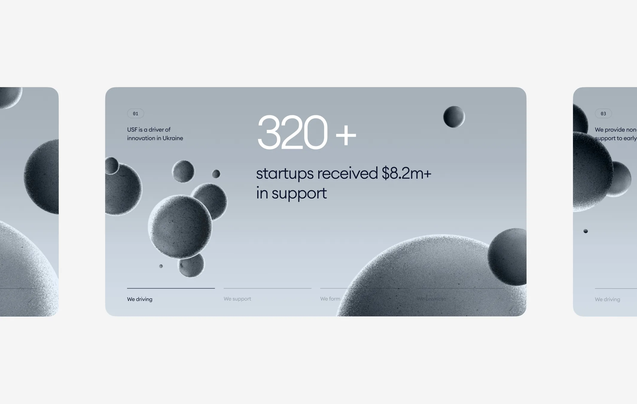
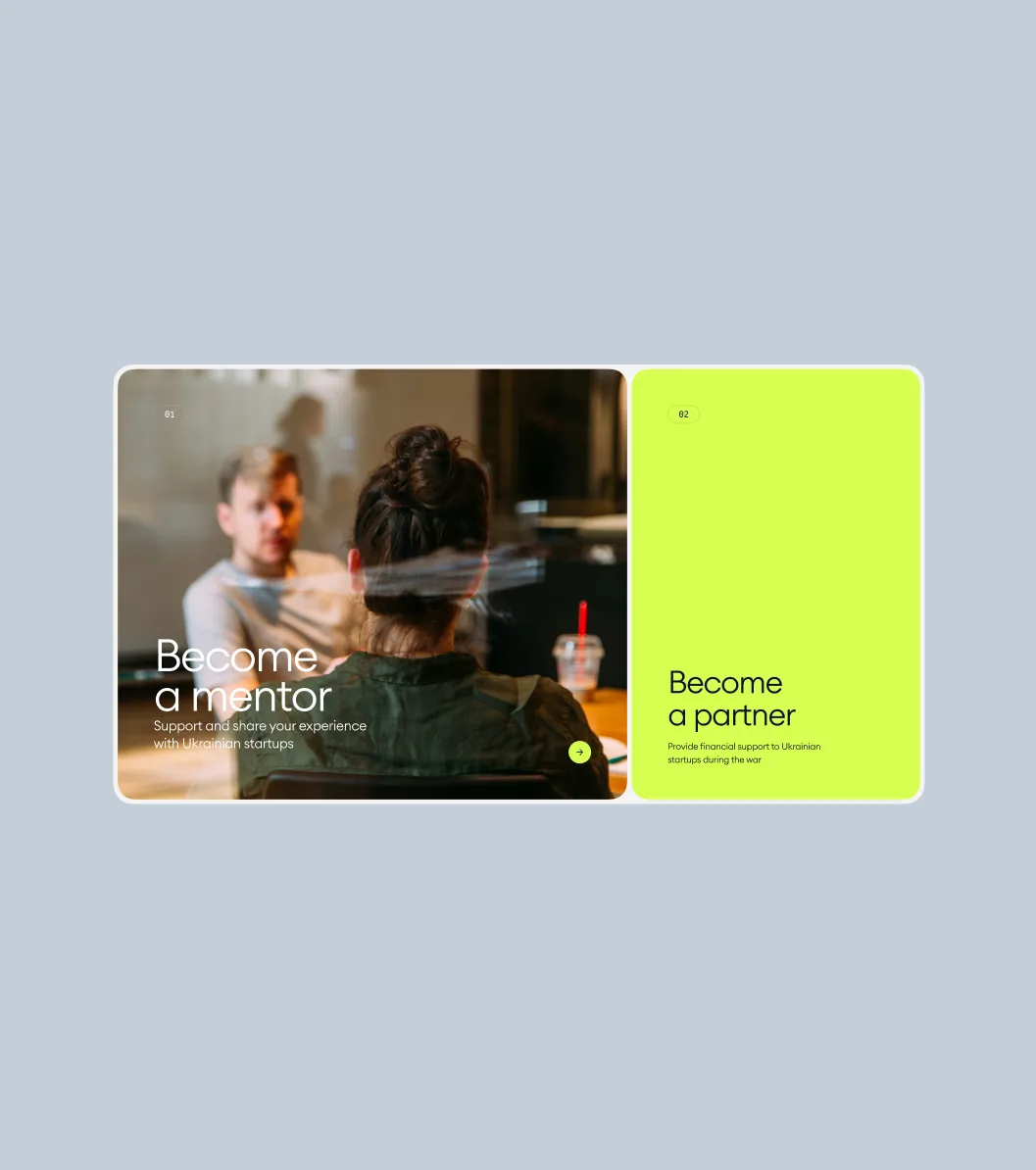
The Ukrainian Startup Fund is a state fund: more than 320 startups have received over $8.2m in support through it. Its site had to serve founders applying for grants and vouchers, mentors, partners and people looking for a job — and still read like a peer to startups, not like a ministry.
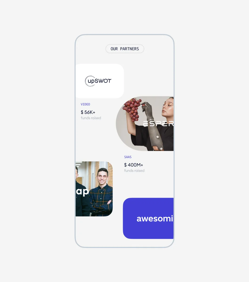
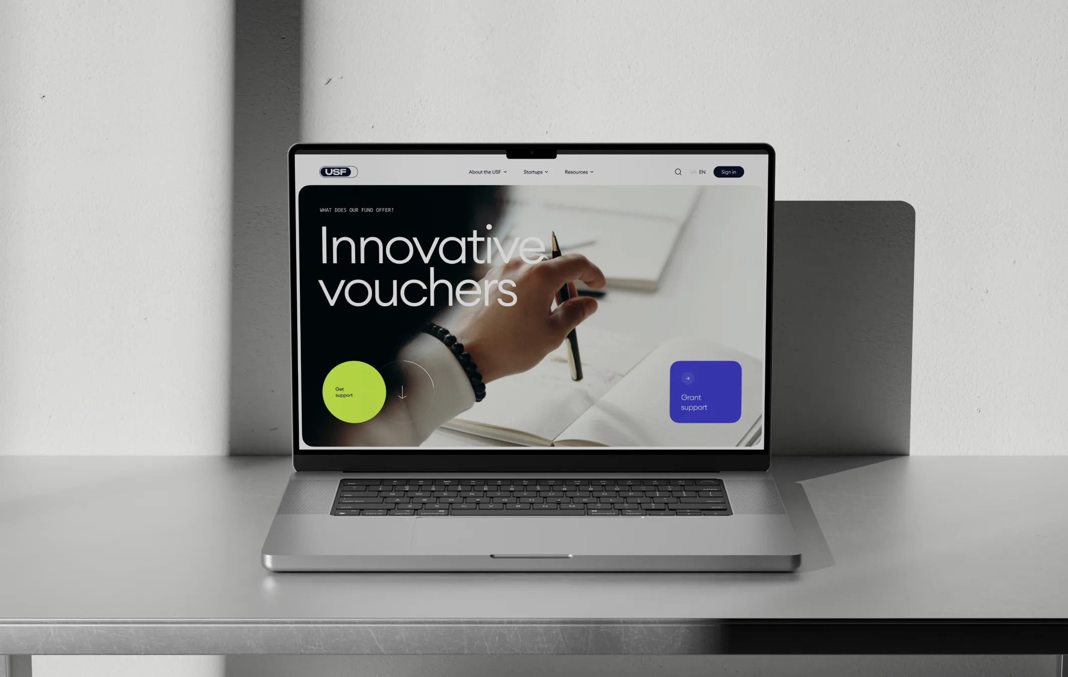
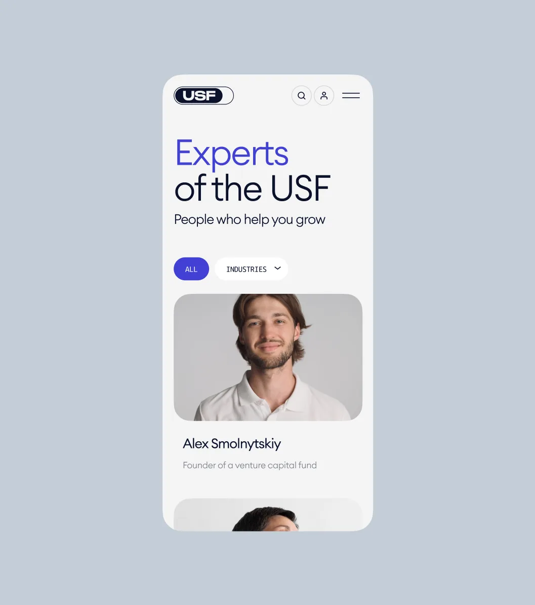
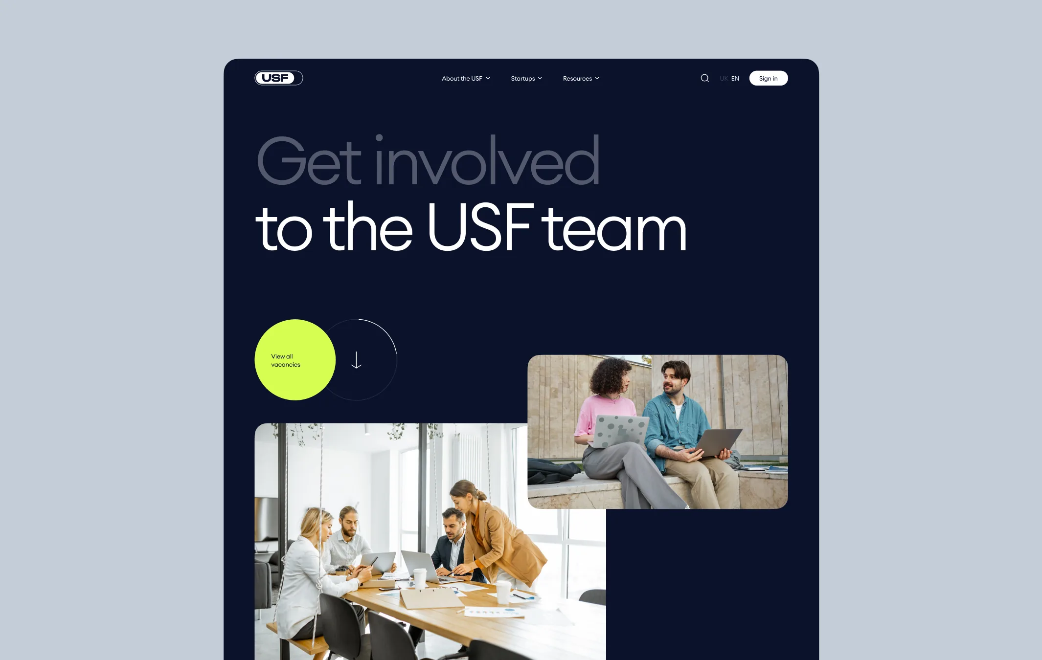
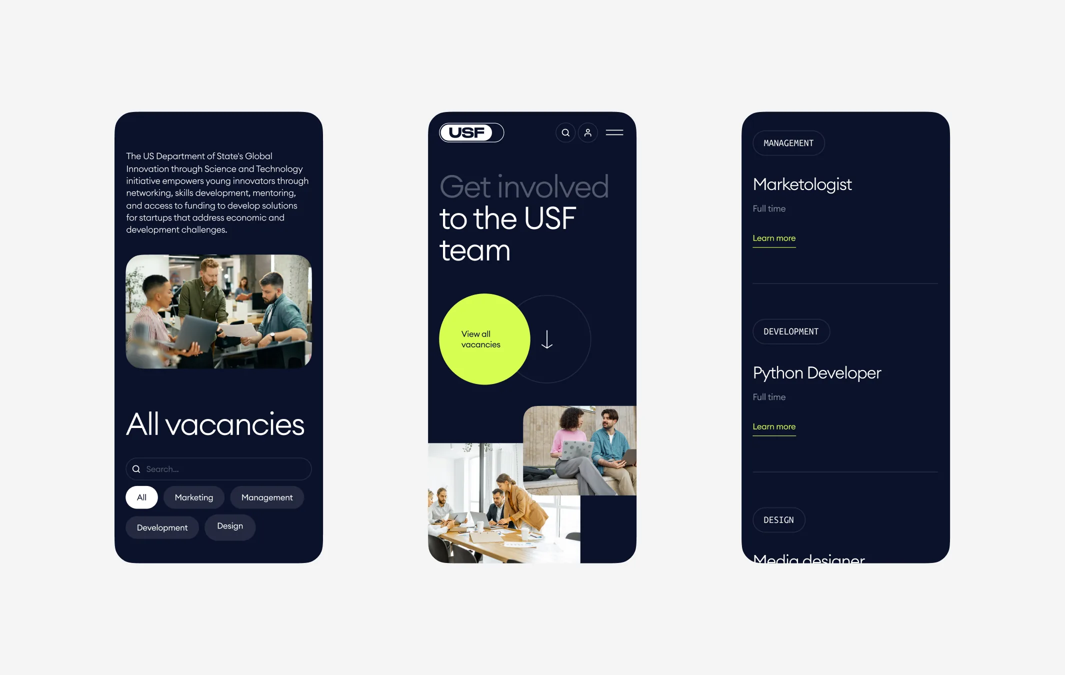
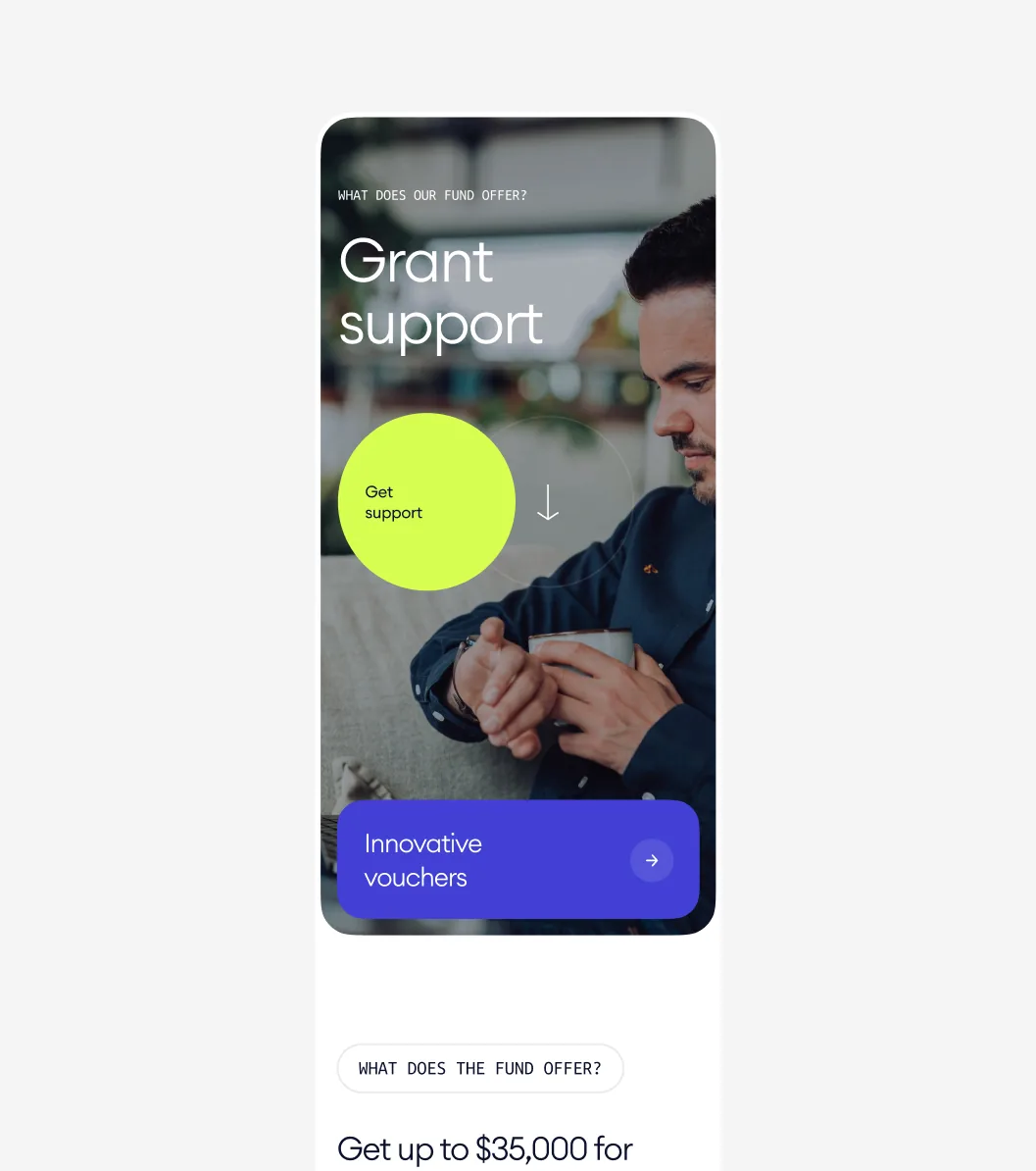
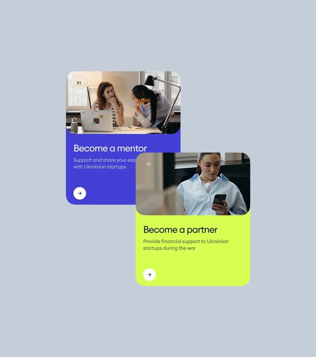
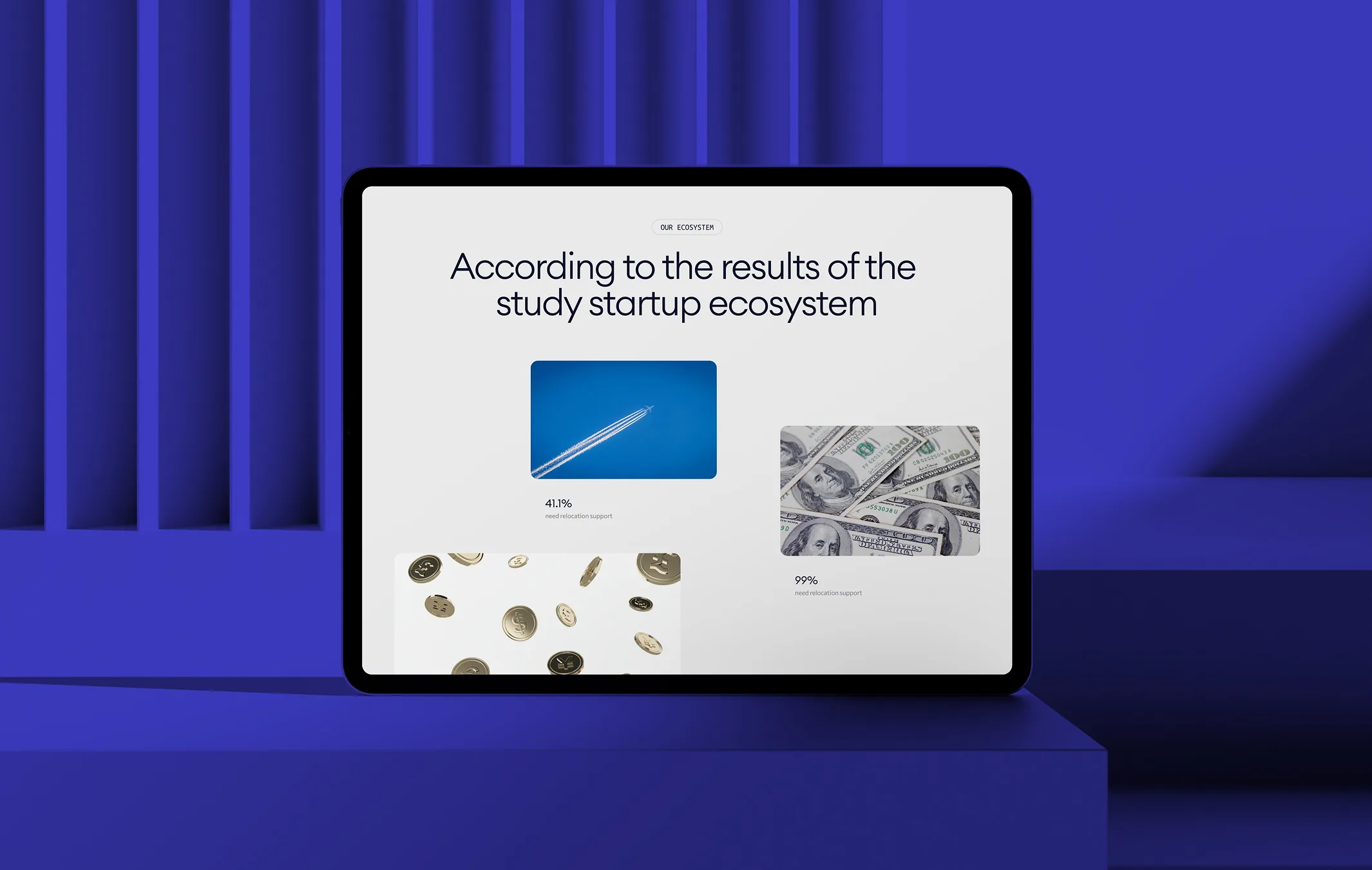
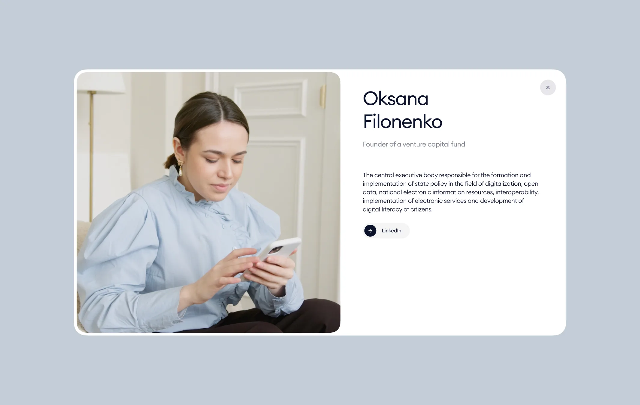
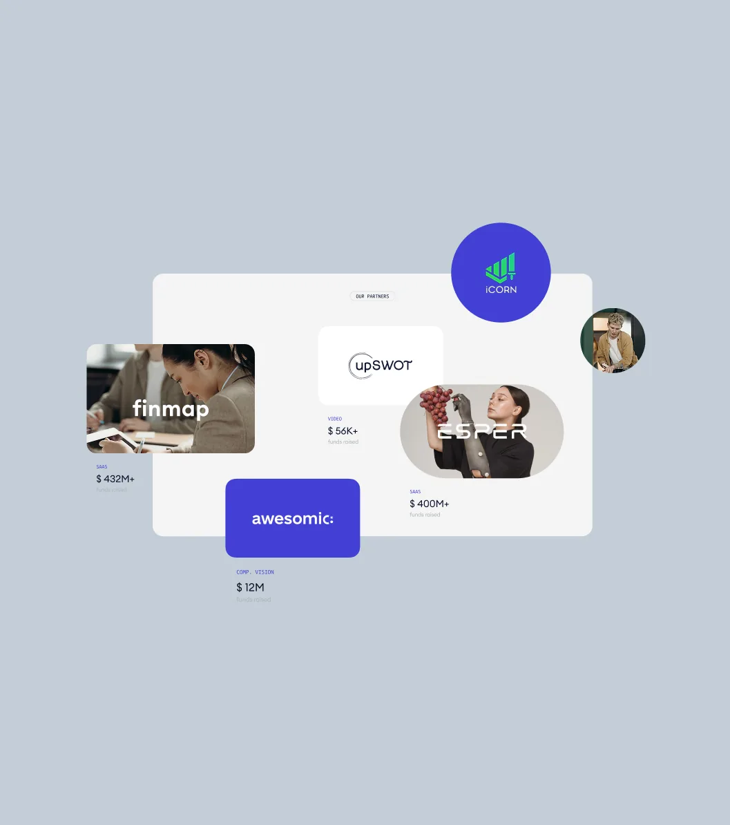
So every page leads with one action. A single lime circle — get support, view vacancies — carries the next step, the numbers do the persuading, and grainy spheres drift behind the headlines so the site moves the way the fund wants its startups to. Experts, partners and financed startups sit one tap away, each with its own card.
In eight weeks we designed the site and its motion — from the homepage to grant programmes, vacancies and expert profiles, on desktop and phone — and handed it to the fund’s own developers. The same look carried onto the fund’s exhibition stand.