The founders came from Genesis, one of Ukraine’s largest product companies, and were building a fund to launch and scale products the same way. They had capital and a track record — and a name that worked against them. Burner read as burning budgets.
Naming took the longest: five or six rounds of direction, because the team was still deciding how it wanted to be seen. We treated that as the work, not a delay. Each round narrowed the answer.
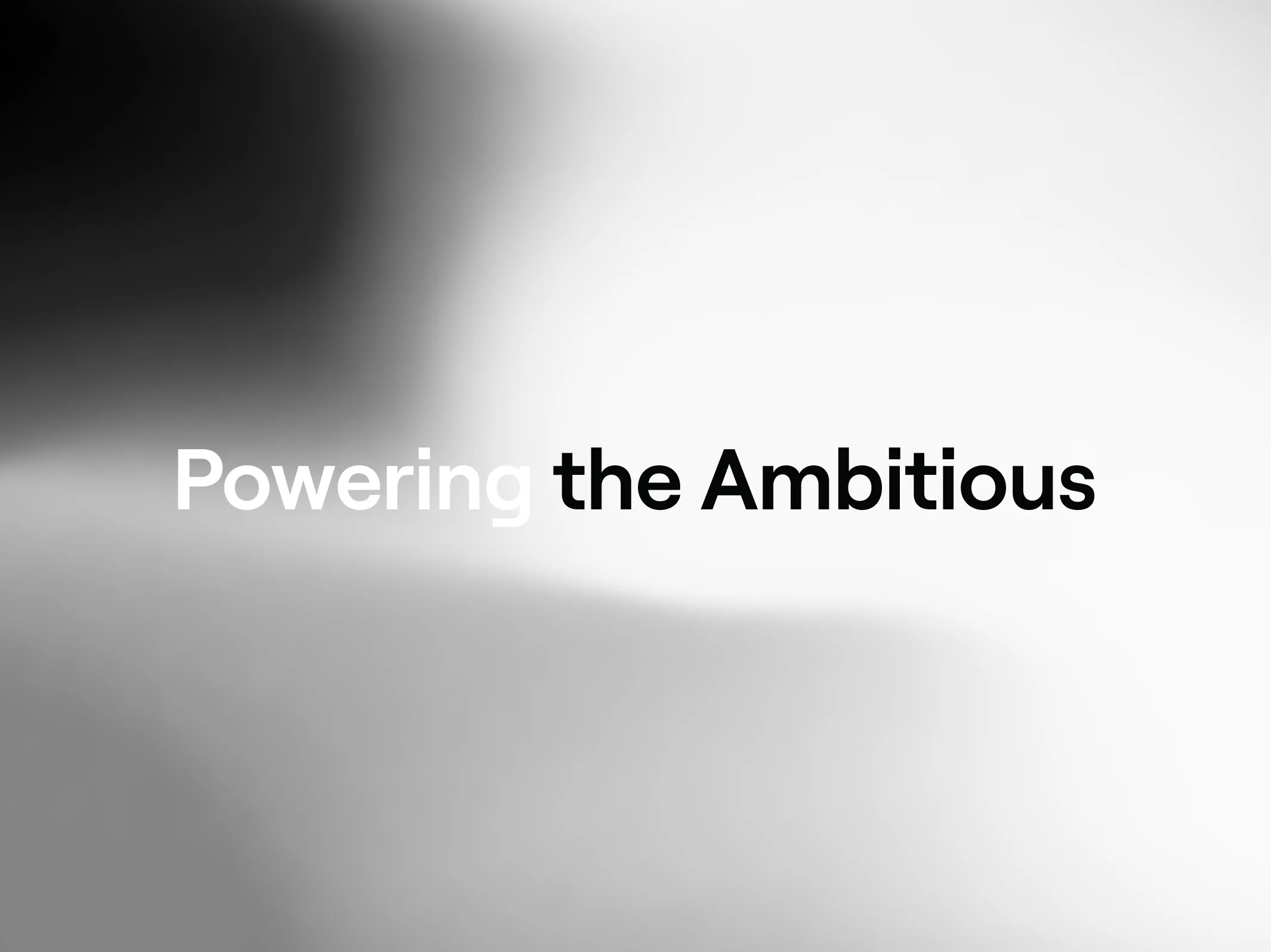
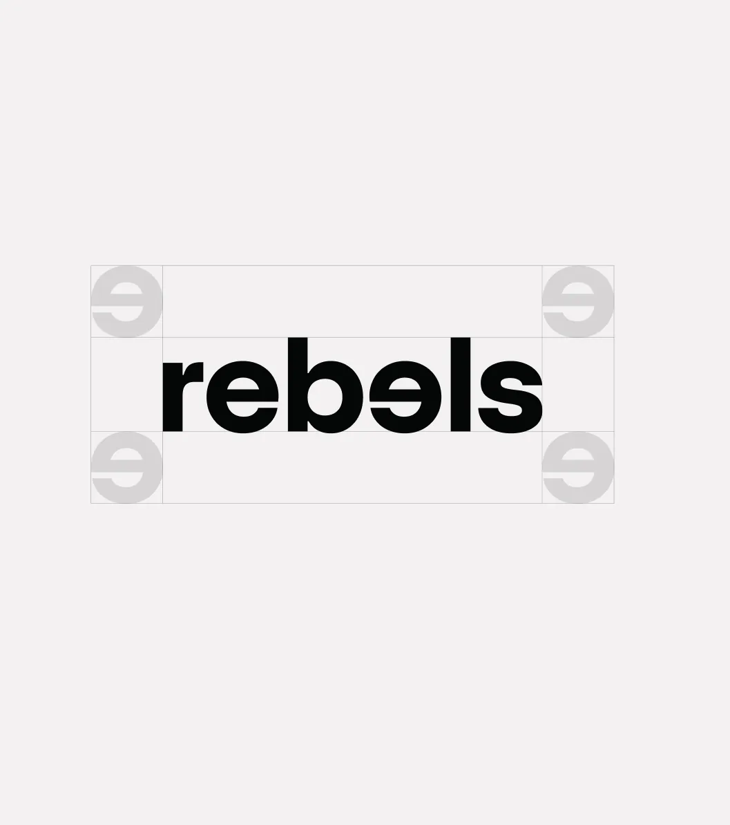
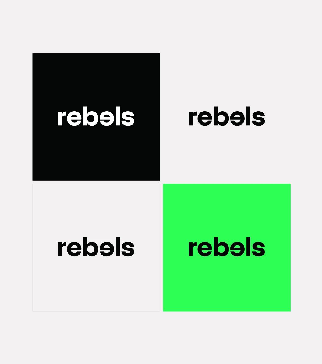
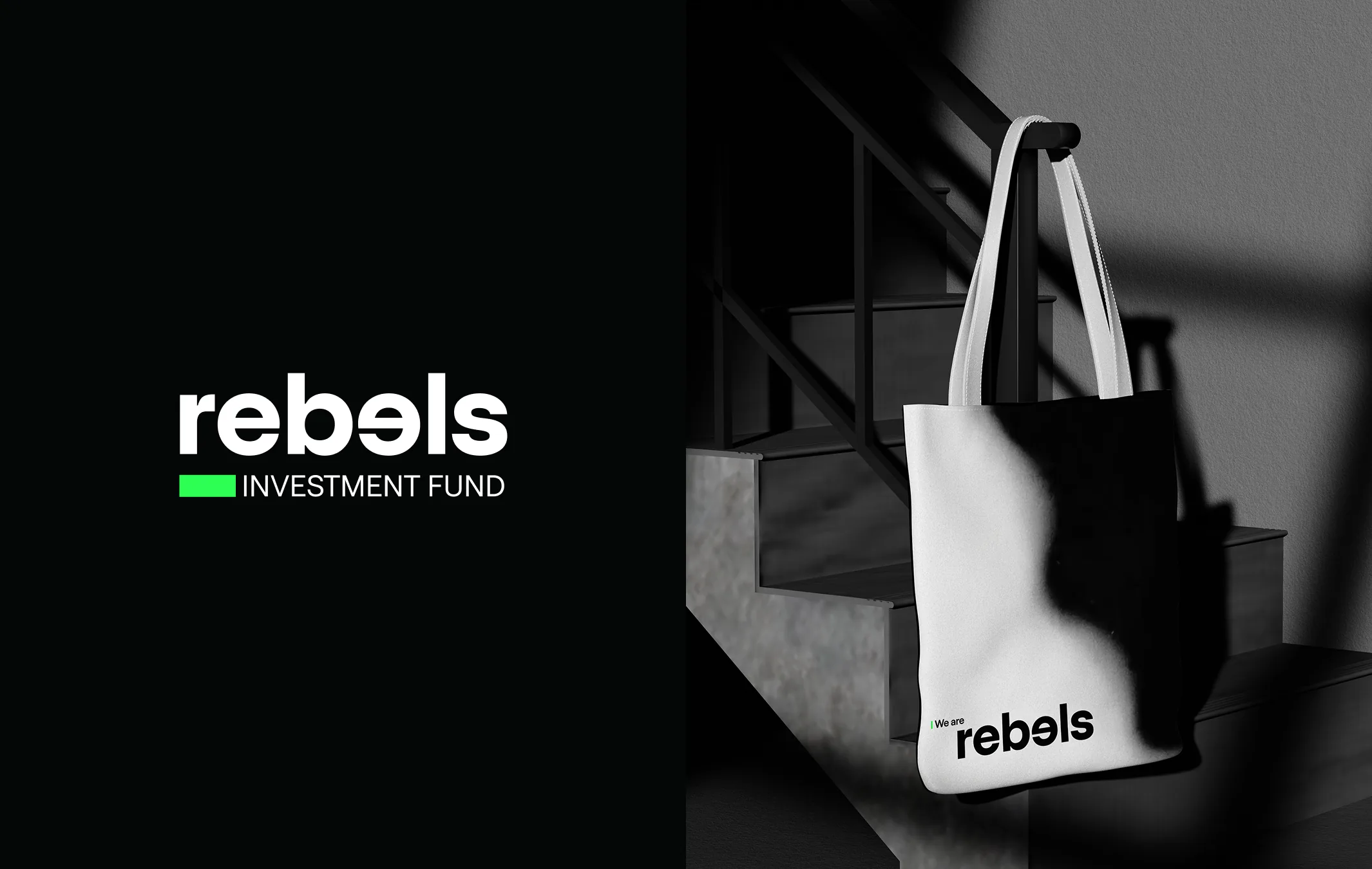
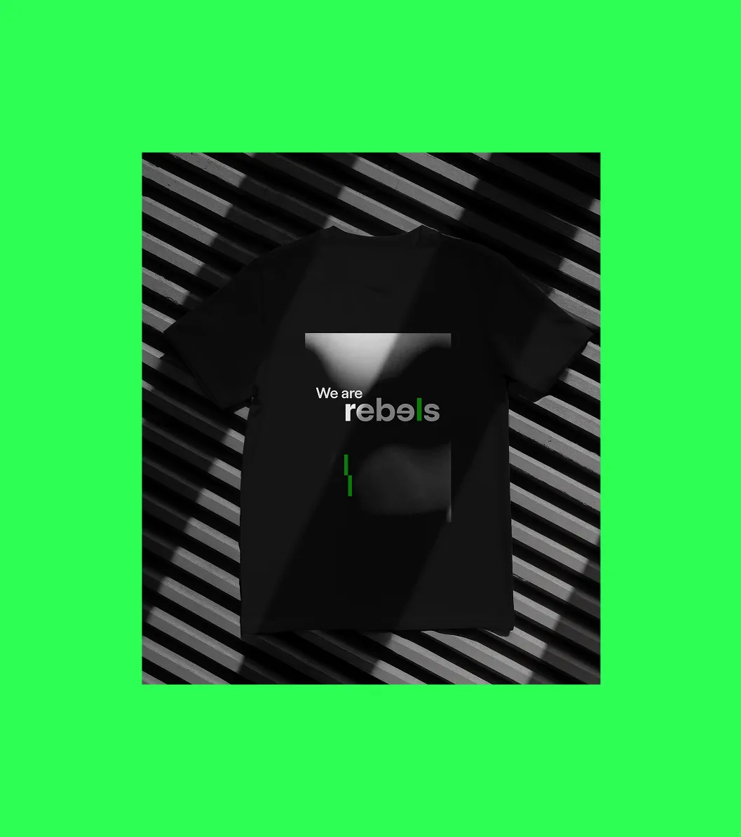
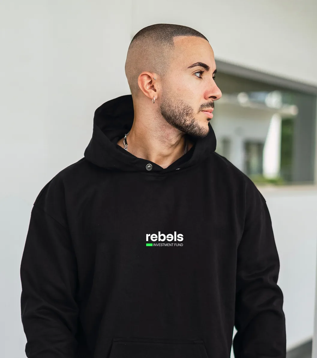
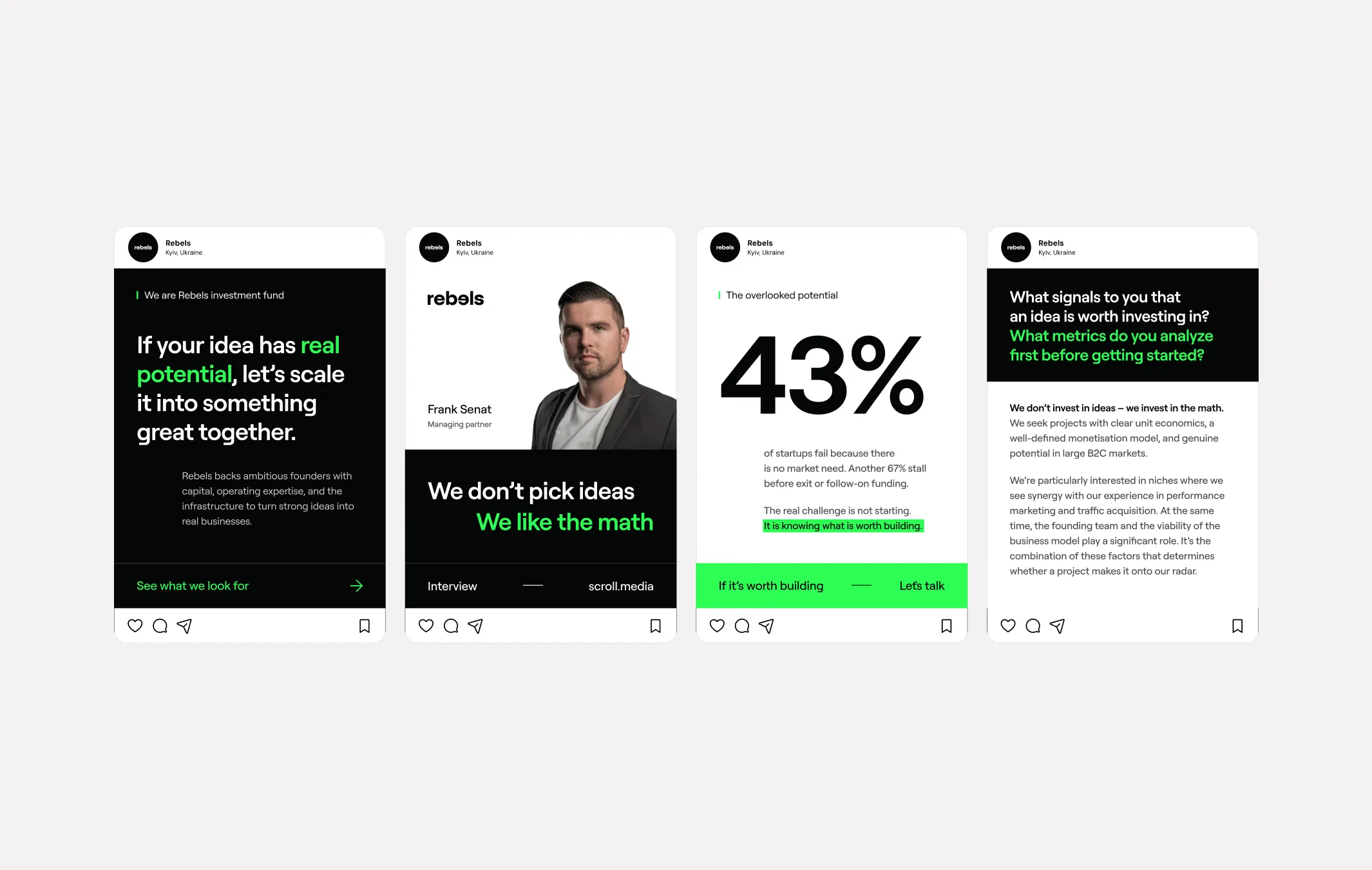
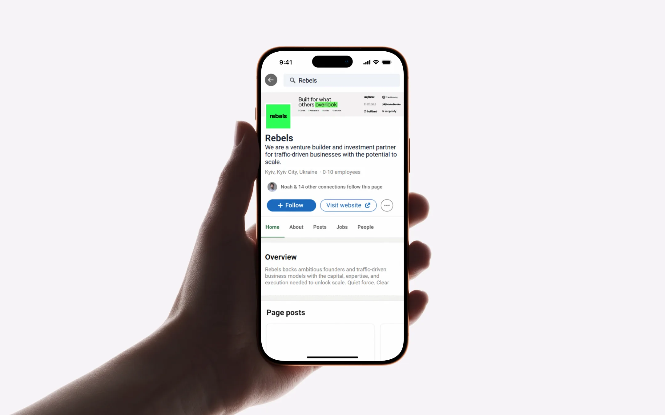
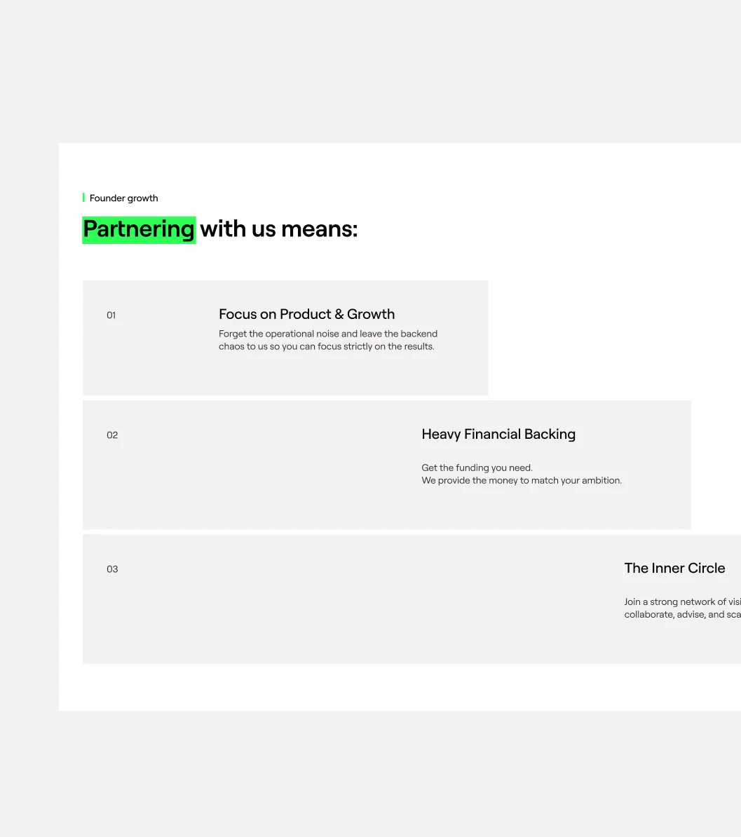
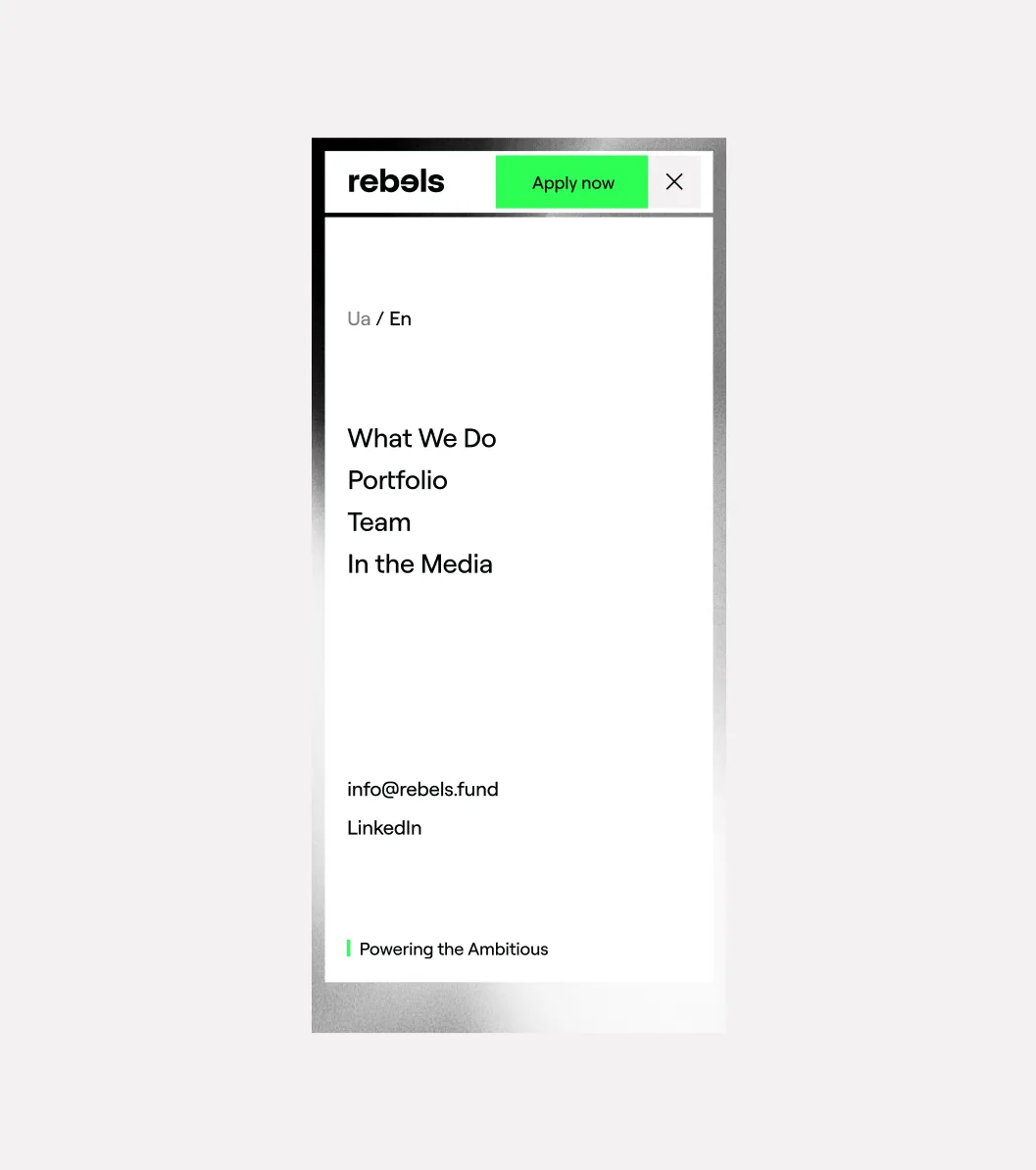
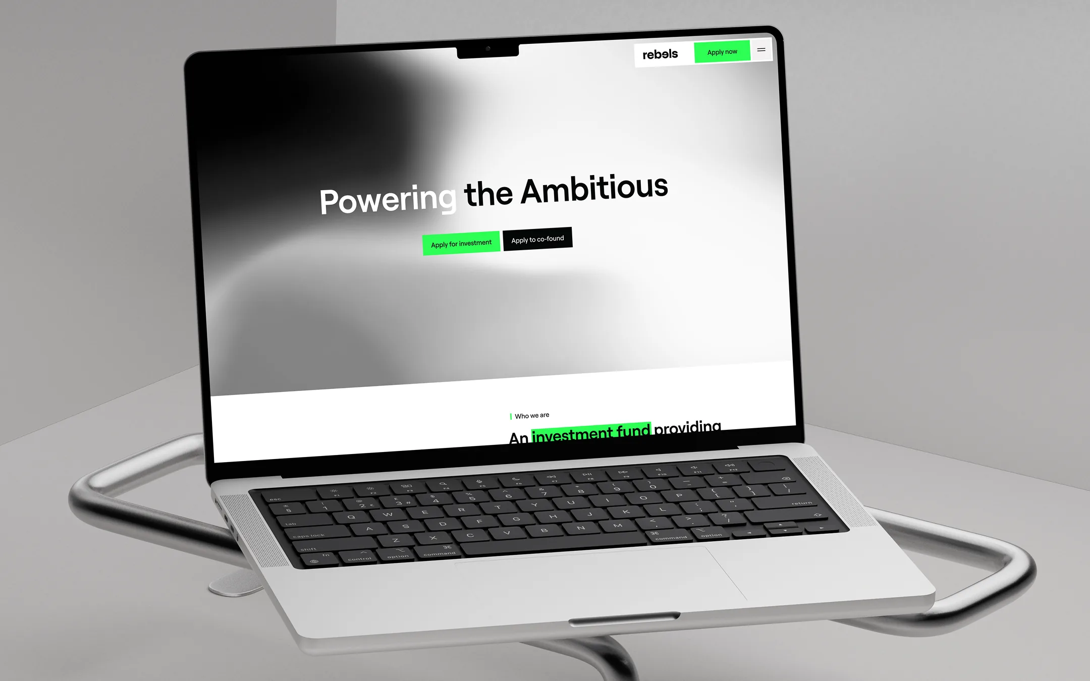
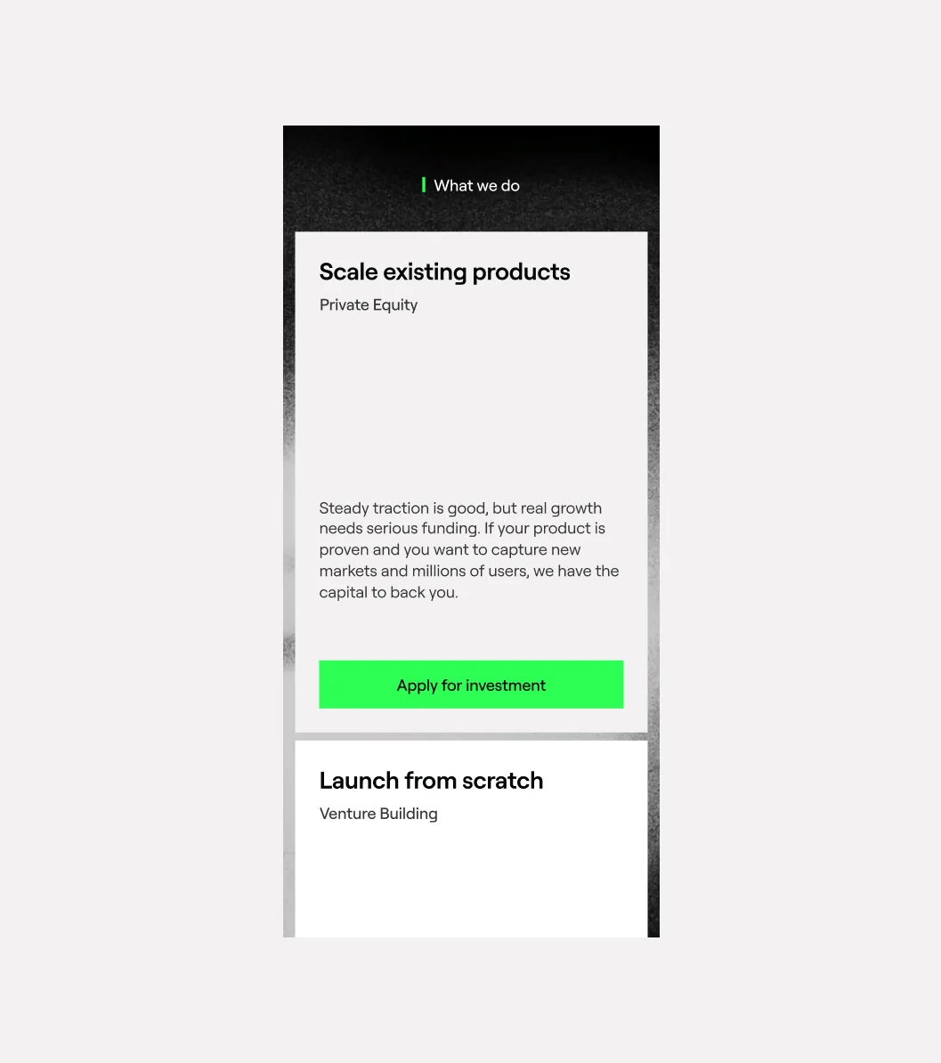
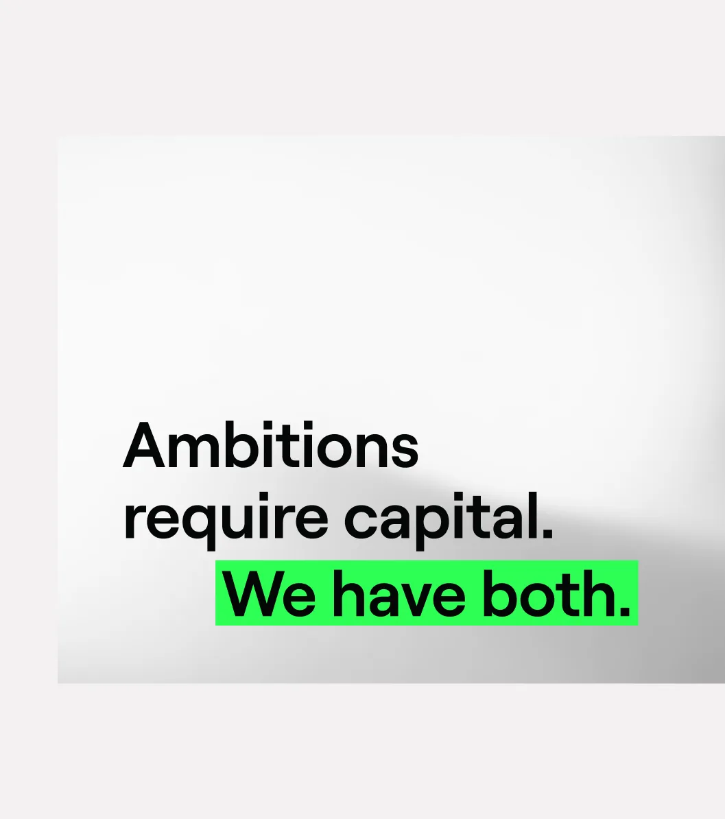
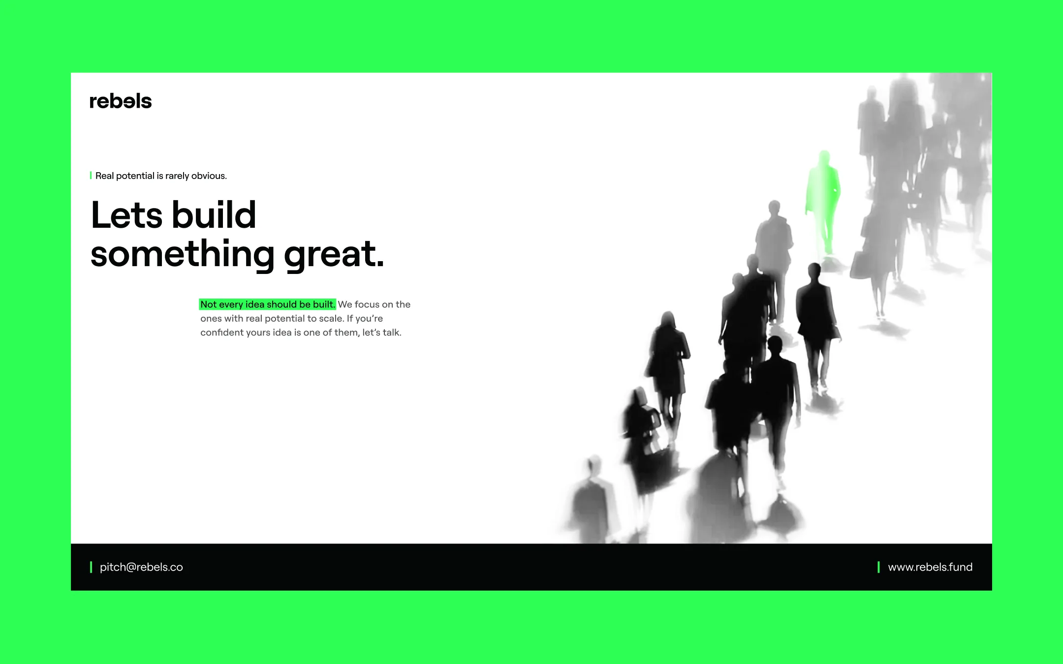
The result is deliberately restrained. The mark is one reversed “e” in a plain wordmark — a rebel that still reads. Black, white and one green, used only where it means something. On the site a single gradient follows the cursor and everything else stays still, so the one moving thing is what you remember.
The brand and the Webflow site were done in six weeks, and ten-plus portfolio companies now sit under a name founders can say without explanation.
rebels.fund